Tile components validated against existing applications
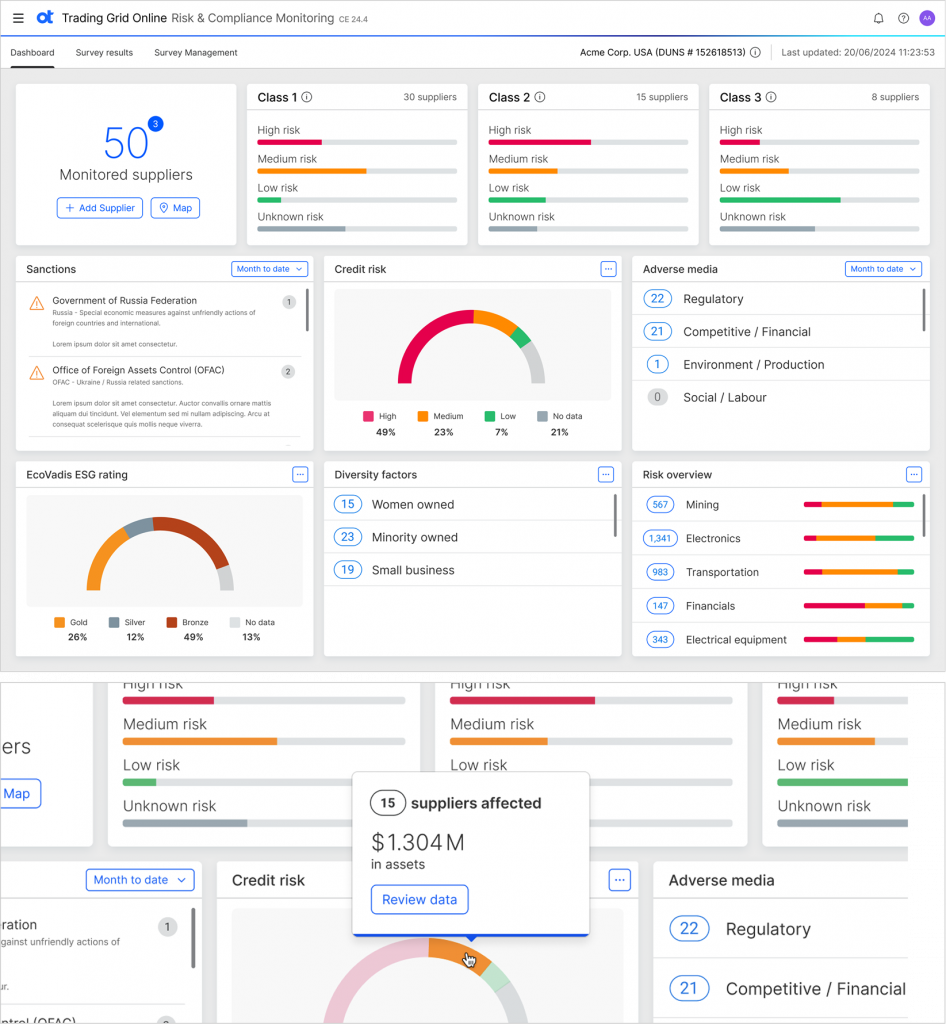
Trading Grid Online
TGO has one of the more analytics-focused dashboards in the OT family of products, making it a good example for validating the design elements. This application deals with Risk & Compliance monitoring, so there are some specific design challenges.
One objective that came out of these design experiments was that the elevations needed tweaking so there could be more hierarchy to information.
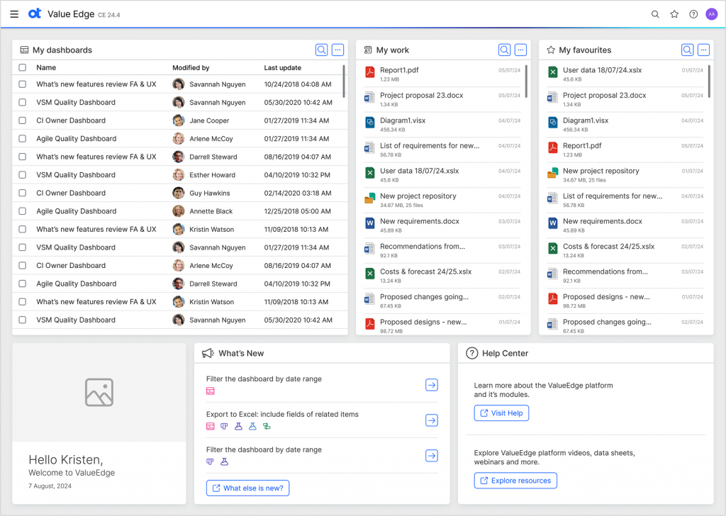
Value Edge
Value edge is a heritage Micro Focus product. As JATO has been brought about to unify all products it is important to validate products from both design systems.
Below is a screenshot of the original application which is designed differently. In the original design the secondary content took too much attention like the introduction so the tiles have been reorganised to place more importance on the day-to-day work.
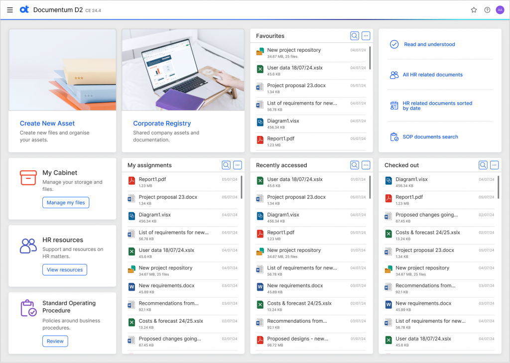
Documentum D2
Documentum D2 is one of the biggest selling products in the OT family. The dashboard is mainly operation-focused, with many links to content and views of recent documents / documents being worked on by a user. It is important that all the relevant information is at their finger tips.
See the previous OT DS version below. The colour schemes are overly dominant and nothing stands out so the scheme has been muted to give a more lighter, more modern look and feel.