This is an internal tool used by a bank for managing communications with regulators across the world. This is a breakdown of my process from research to ideation. I have provided some detail around the research plan, outcomes and design concepts as a demonstration of my design process.
There are a number of key point learned from the early engagements with the product team:
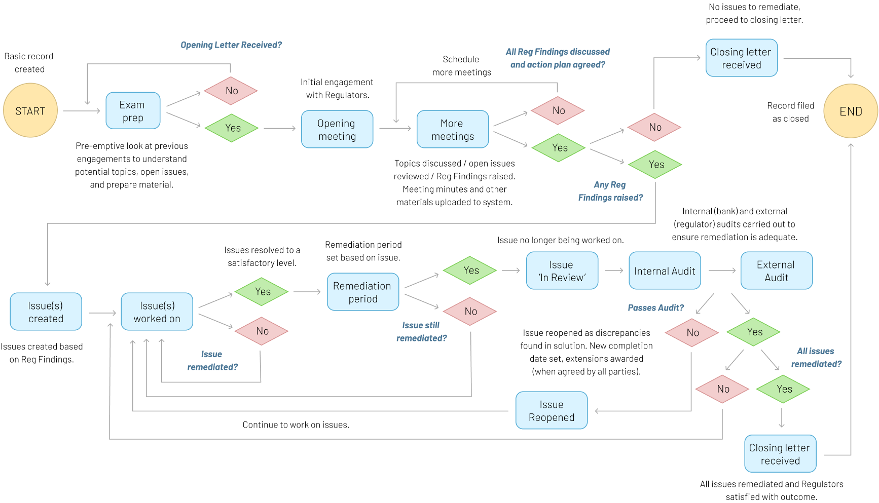
Seven roles where identified within the system provided by the product team:
Interaction Manager
Exam Manager
Regulatory Engagement Lead
Issue Manager
Governance User
Reporting User
Correspondence User
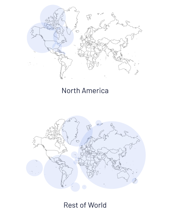
The product team indicated there are some subtle differences in regulatory engagements for:
There were some common paint points that the product team were already aware of:
The system has a steep learning curve.
Anyone that uses the tool infrequently ends up relearning it each time.
Users don’t see it as a productivity tool - it’s an after-the-fact record store that they only input into because they have to.
Users would like task-driven workflows but don’t envisage the tool being that.
Many users carry out multiple roles from the 7 identified.
A more detailed and in-depth approach to research was chosen. With the product never having UX input this was important. This is how it was carried out:
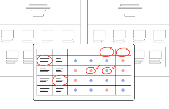
A well known CRM tool is adaptable to be a Regulatory Engagement Tool and had been put forward as an option moving forward. This could provide some ideas around useful patterns / approaches as well as checking suitability of the tool.
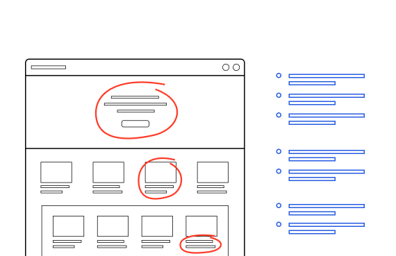
As this project was has never been involved in UX activities it was important to scrutinise the usability of the existing system. This will identify some quick wins and improvements that don’t require direct user input.
Conducted workshops with the product team to gain a better understanding of the product, and identify more focused areas of the system for inquiry, and understand user objectives to target for questioning. Worked with the product team and key stakeholders to ensure the lines of questioning were inline with the product vision.
This is the split of users interviewed between North America and Rest of World
Split of users by experience level in order of Novice, Intermediate and Expert
Of users interviewed operate multiple roles within the tool
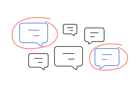
Each interview had a FigJam page where insights and quotes were gathered. Here are some examples of user feedback:
“Interactions and Exams are too complicated.”
“The system needs simplified.”
“When I try to assign a user to a role in a record, their name appears in red but there is no information. I’m not sure what this means.”
“I don’t use it that often - every time I have to learn it again.”
“I find it hard to find the information I need.”
“If I wanted to find all the records for 2025, I wouldn’t know how to do it.”
“Reporting is not useful to my role.”
“I only need to fill 5 fields to create a record.”
“I need a ‘Gold Source’ tool - too much of the information here is filler or inaccurate.”
All feedback gathered organised by question across all interviews and codified. Organised into themes to identify routes for further UX inquiry.
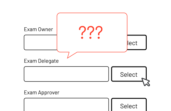
Users are not that confident about inputting data in the system. They don’t understand where to put the correct information at times, or have no understanding of the correct format. Labelling of fields can be vague and make it hard to identify the right location. Most users don’t really understand what they are required to fill in to make a ‘complete’ record as there is no in system guidance to support this.
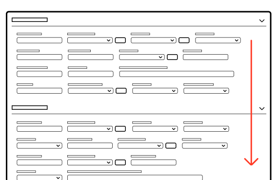
Users feel that there is information overload when using the tool – they find it hard to find the right information. The records are long, and display every possible field all at once, but only a core set are used by the majority of users. Many statuses appear in a single record making it hard to understand.
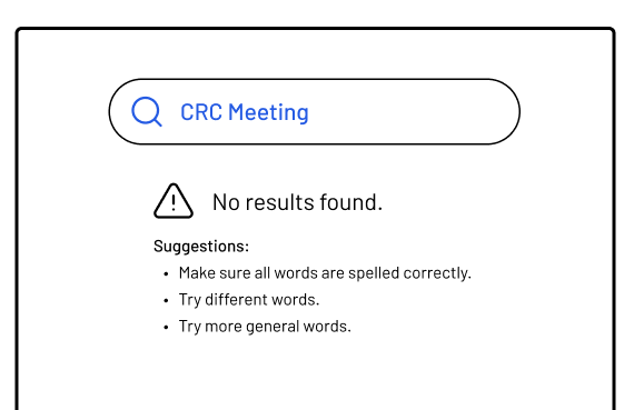
Finding data in the system is difficult and not centralised. It doesn’t support ‘fuzzy search‘ capabilities, and relies on users knowing the exact name or ID of the record to find it. Filter options are vast and it’s hard to identify what is the relevant one to use, and saved search is hidden functionality.
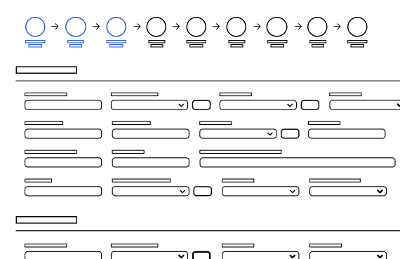
Users have to run reports to get an overview of certain perspectives of the system, and would like to see this information more readily available to support their daily work and the status of records. Status in records covers all phases of the record, not the current state and takes a lot of unpacking to understand.
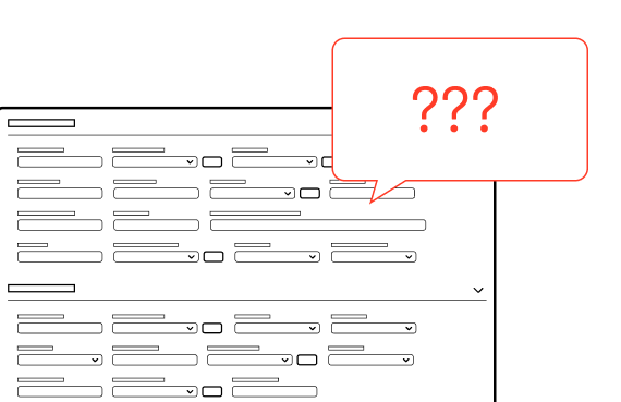
Help resources in-record and system are lacking or not that visible, leading to users reaching out directly to the product team. There is no access to the standards that are the single source of truth for regulatory engagement within the system that critical to business operations.
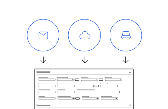
The tool connects to other in-business tools but the integrations lack the key information required. Users and their teams utilise productivity tools such as O365 to supplement the task tracking of their work, and for storing assets used in Regulatory engagements. They would like to see more integrations with these systems to better streamline their work flows.
Reporting coverage is poor for most roles in the tool so more specific reports that supplement daily tasks is a must. The tools don’t support scheduling of reports – this is needed for start of week reports that may take 4 hours to generate.
Having a basic understanding of the users is always important. Some of the work on the product required a quick turnaround in the early stages, so having something to quickly validate design decisions against would be critical. The archetypes provided a quick reference point for user empathy. Some examples below:
The team were considering outsourcing the project to a well known CRM platform that can be used for Regulatory Engagement as an alternative to working the existing system. I analysed it’s suitability as a replacement, any to also take some lessons from what they are doing well that could feed into a in-house product.
There are some really nice features in the CRM tool, and the UI is a major improvement on the the existing tool, but it lacks the flexibility to focus on the right information. It also doesn’t fully cover the requirements and expectations of regulatory engagements the business demands, so the recommendation was to stick with an in-house solution.
With this product never having UX input to date, this was an essential task as there would be plenty of room for improvement around usability. This task was completed by 2 designers, then collated into affinity boards and aligned with the themes discovered in user research:
PROBLEM / RECOMMENDATION
PROBLEM / RECOMMENDATION
PROBLEM / RECOMMENDATION
PROBLEM / RECOMMENDATION
PROBLEM / RECOMMENDATION
There are some really nice features in the CRM tool, and the UI is a major improvement on the the existing tool, but it lacks the flexibility to focus on the right information. It also doesn’t fully cover the requirements and expectations of regulatory engagements the business demands, so the recommendation was to stick with an in-house solution.
Based on outcomes of the research a number of key UX initiatives were identified and proposed.
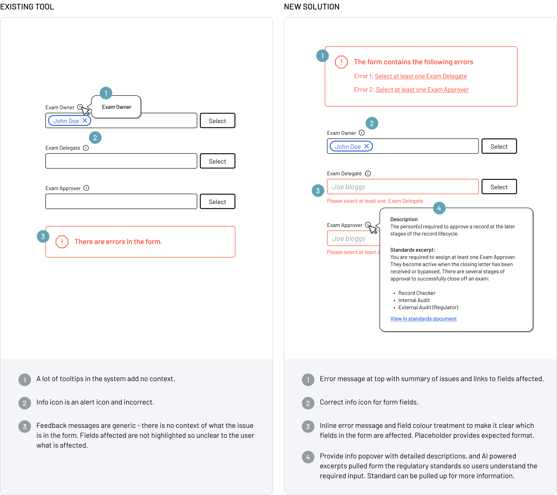
Based on research feedback it has become clear that a lot of users struggle to populate records correctly. Governance users feedback has indicated they spend a lot of their time fixing incorrectly inputted record information. The guardrails and guidance for input need to improve so users can confidently enter data.
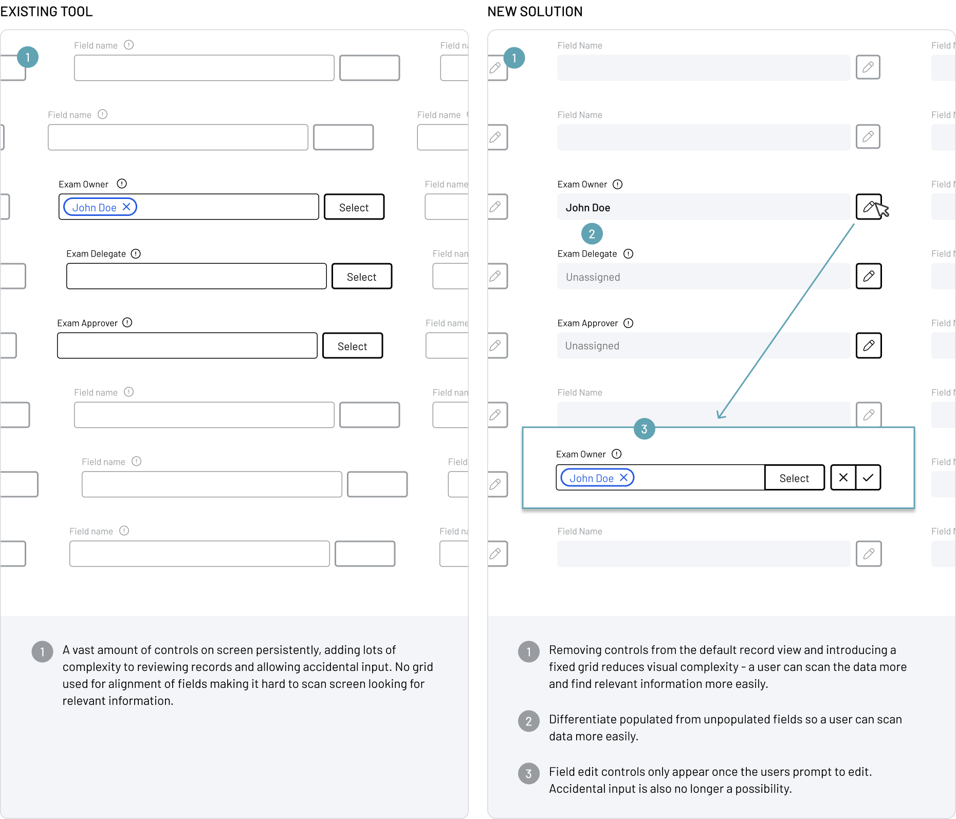
Speaking to the different user groups revealed some patterns of use of records in the system. Multiple user roles want to review a record and won’t make changes, though the default view of a record is to show the extensive list of editable form fields. This complicates the display of records and opens up the possibility of accidental input.
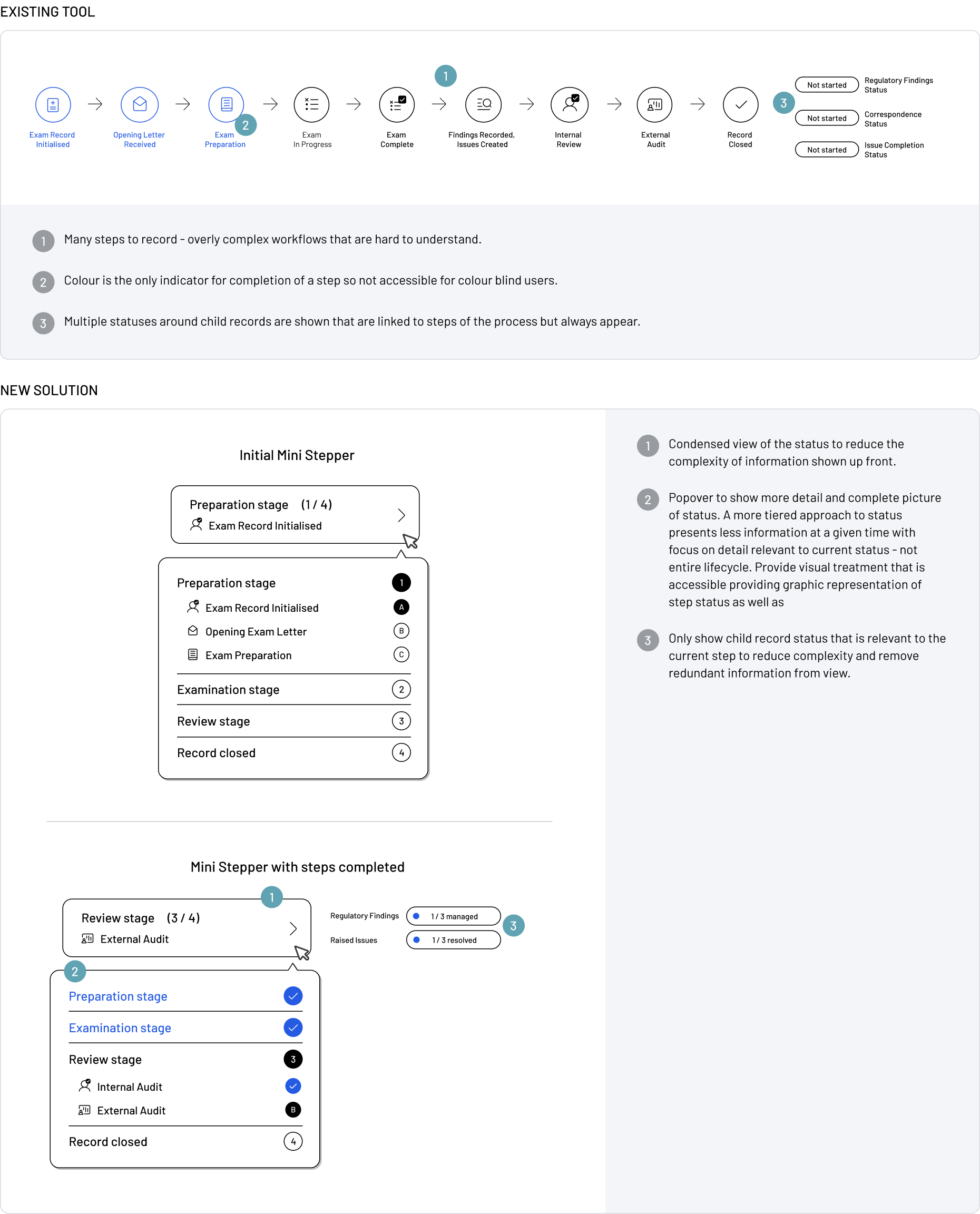
Users have indicated that record status can be so complex that is very difficult to understand the current state. A new approach is required to allow users to fully understand the records progression and all statuses of underlying child records.
