REGULATORY EVENT
MANAGEMENT TOOL

This is an internal tool used by a bank for managing communications with regulators across the world. This is a breakdown of my process from research to ideation. I have provided some detail around the research plan, outcomes and design concepts as a demonstration of my design process.

Key learnings from early engagements and workshops

There are a number of key point learned from the early engagements with the product team: 

  • This was a new UX engagement – the project had a UI designer in the past but no UX, and no design resource at this time. The project design had been carried out between developers and the product team using powerpoint.
  • Design was generally started at the point it was introduced to the dev sprint cycle. Topics were only investigated at this point with very little time to speak to users. The team based solutions on their own knowledge of the system and their mindset.
  • New features were just added on top of the existing tool, without any systems thinking, or thought of how it impacts UX.
  • The system is generally seen as a record store – not a task and workflow management tool.
  • There is no concept of user roles in the system, only specific entitlements from a technical perspective. For example; Record Initiator, Record Owner etc.

Initial understanding of users based on product team feedback

Seven roles where identified within the system provided by the product team:

Interaction Manager

Exam Manager

Regulatory Engagement Lead

Issue Manager

Governance User

Reporting User

Correspondence User

The product team indicated there are some subtle differences in regulatory engagements for:

There were some common paint points that the product team were already aware of:

The system has a steep learning curve.

Anyone that uses the tool infrequently ends up relearning it each time.

Users don’t see it as a productivity tool - it’s an after-the-fact record store that they only input into because they have to.

Users would like task-driven workflows but don’t envisage the tool being that.

Many users carry out multiple roles from the 7 identified.

Exam Workflow

Research plan to guide future UX initiatives

1:1 Contextual Inquiry Interviews

A more detailed and in-depth approach to research was chosen. With the product never having UX input this was important. This is how it was carried out:

 
  • 3/4 users per role for good coverage of each role.
  • A mix of experience levels with the system, so we can understand new users issues as well as hacks experienced users perform to get around problems.
  • A mix of frequency of use, so we can pin point why the system needs to be relearned by some users.


Competitive Analysis

A well known CRM tool is adaptable to be a Regulatory Engagement Tool and had been put forward as an option moving forward. This could provide some ideas around useful patterns / approaches as well as checking suitability of the tool.

Heuristic Review

As this project was has never been involved in UX activities it was important to scrutinise the usability of the existing system. This will identify some quick wins and improvements that don’t require direct user input.

Lines of inquiry for 1:1 interviews to get the right feedback

Conducted workshops with the product team to gain a better understanding of the product, and identify more focused areas of the system for inquiry, and understand user objectives to target for questioning. Worked with the product team and key stakeholders to ensure the lines of questioning were inline with the product vision.

  • Demographics questions to validate the users location, experience in the system, frequency of use, and ensuring the role they are being interviewed for is accurate.
  • Questions around experience level split between novice, intermediate and expert – users would be asked based on their answers in the demographic section.
  • Questions specific to each of the 7 roles – users would be asked based on their answers in the demographic section.
  • General questions general sentiment, ability to find their way around the system etc.
  • Questions around what they liked to see if there was no limit to budget or resources.

Research outcomes and insights gathered and understood

18 : 3

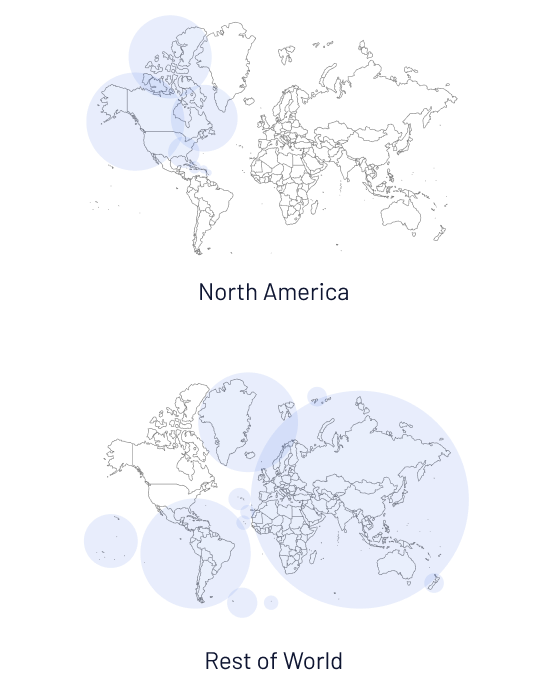
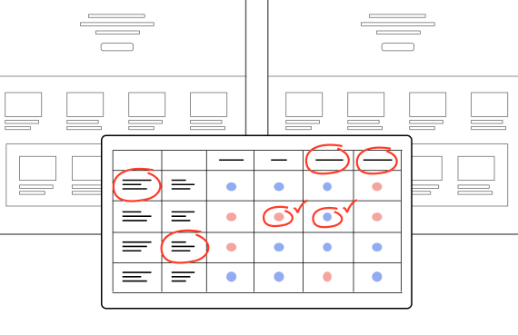
This is the split of users interviewed between North America and Rest of World

7 : 6 : 8

Split of users by experience level in order of Novice, Intermediate and Expert

71.4%

Of users interviewed operate multiple roles within the tool

Insights recorded, collated and themes identified

Each interview had a FigJam page where insights and quotes were gathered. Here are some examples of user feedback:

“Interactions and Exams are too complicated.”

The system needs simplified.”

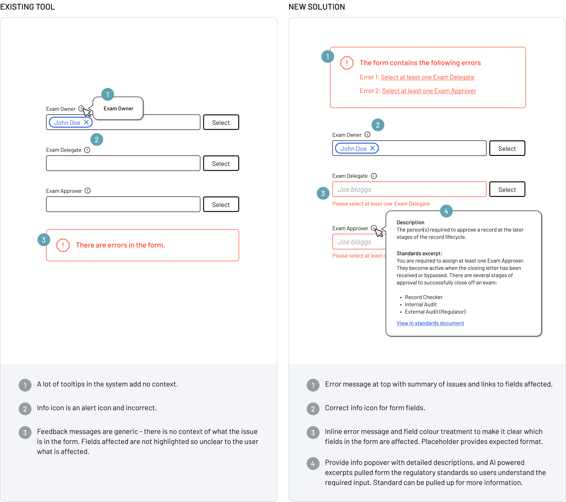
“When I try to assign a user to a role in a record, their name appears in red but there is no information. I’m not sure what this means.”

“I don’t use it that often - every time I have to learn it again.”

“I find it hard to find the information I need.”

“If I wanted to find all the records for 2025, I wouldn’t know how to do it.”

“Reporting is not useful to my role.”

“I only need to fill 5 fields to create a record.”

“I need a ‘Gold Source’ tool - too much of the information here is filler or inaccurate.”

Empathy maps created to identify common feedback and themes

All feedback gathered organised by question across all interviews and codified. Organised into themes to identify routes for further UX inquiry.

7 common themes of feedback were identified

Data input and guidance

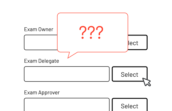
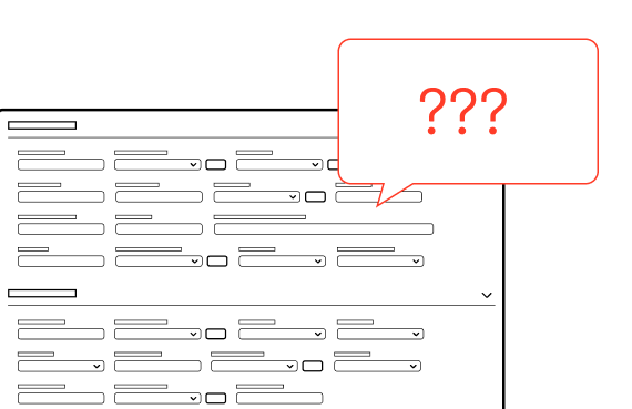
Users are not that confident about inputting data in the system. They don’t understand where to put the correct information at times, or have no understanding of the correct format. Labelling of fields can be vague and make it hard to identify the right location. Most users don’t really understand what they are required to fill in to make a ‘complete’ record as there is no in system guidance to support this.

Ease of use / simplification

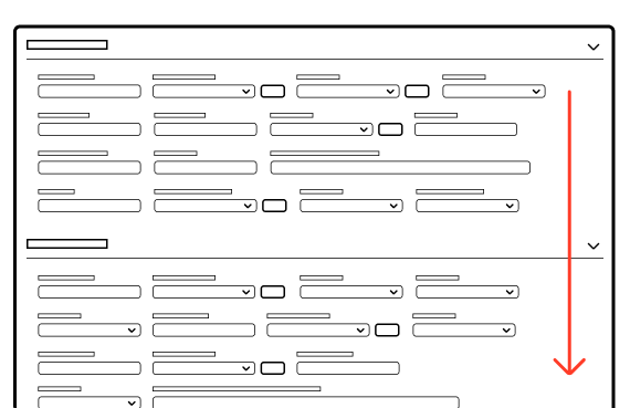
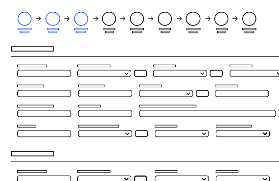
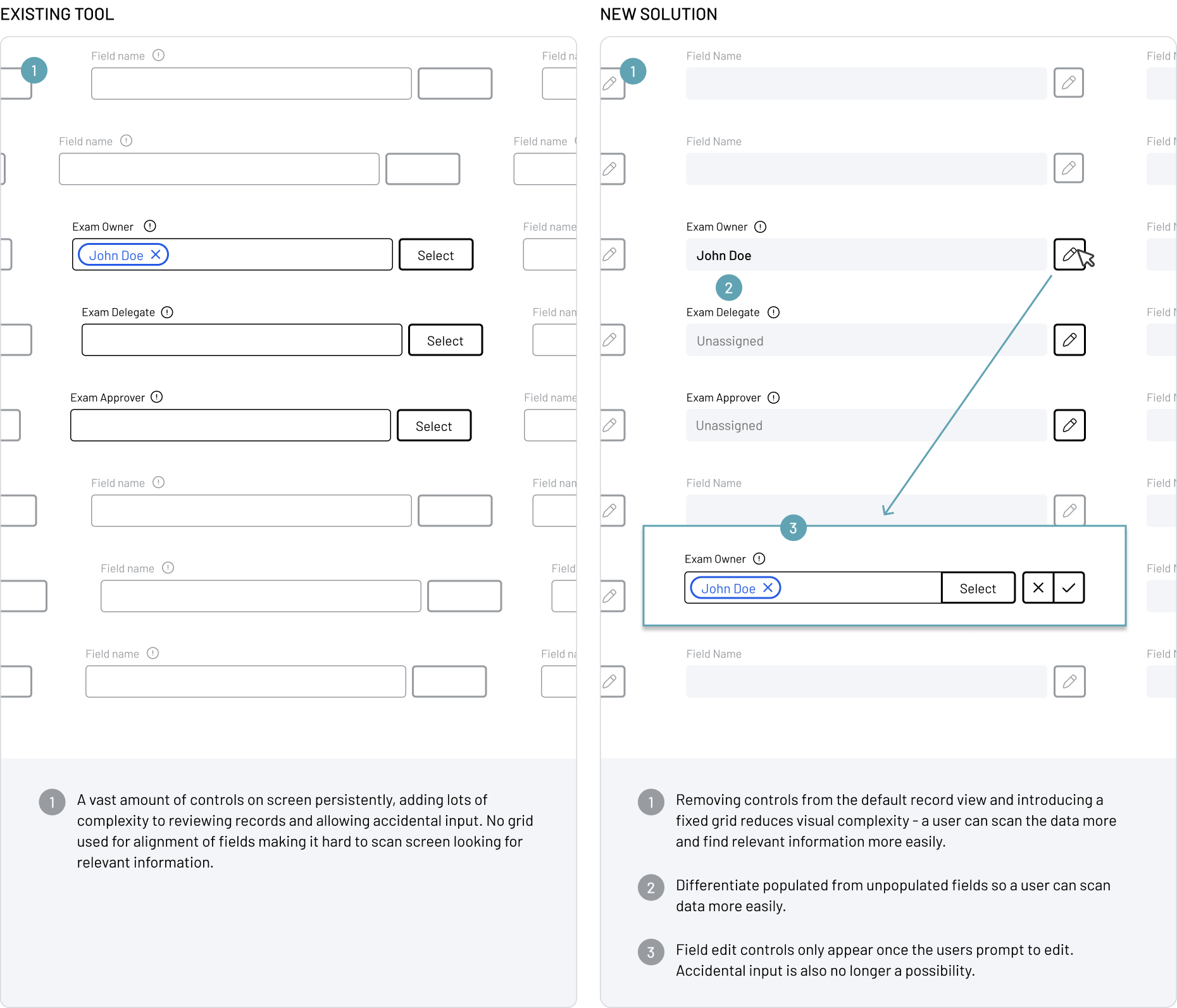
Users feel that there is information overload when using the tool – they find it hard to find the right information.  The records are long, and display every possible field all at once, but only a core set are used by the majority of users. Many statuses appear in a single record making it hard to understand.

Find my data easily

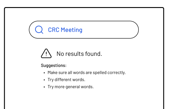
Finding data in the system is difficult and not centralised. It doesn’t support ‘fuzzy search‘ capabilities, and relies on users knowing the exact name or ID of the record to find it. Filter options are vast and it’s hard to identify what is the relevant one to use, and saved search is hidden functionality.

Visibility of status

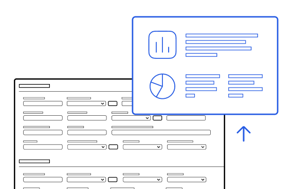
Users have to run reports to get an overview of certain perspectives of the system, and would like to see this information more readily available to support their daily work and the status of records. Status in records covers all phases of the record, not the current state and takes a lot of unpacking to understand.

Help and documentation

Help resources in-record and system are lacking or not that visible, leading to users reaching out directly to the product team. There is no access to the standards that are the single source of truth for regulatory engagement within the system that critical to business operations.

Better integrations

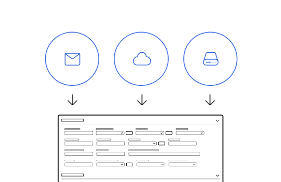
The tool connects to other in-business tools but the integrations lack the key information required. Users and their teams utilise productivity tools such as O365 to supplement the task tracking of their work, and for storing assets used in Regulatory engagements. They would like to see more integrations with these systems to better streamline their work flows.

More reporting coverage

Reporting coverage is poor for most roles in the tool so more specific reports that supplement daily tasks is a must. The tools don’t support scheduling of reports – this is needed for start of week reports that may take 4 hours to generate.

Archetypes created from feedback

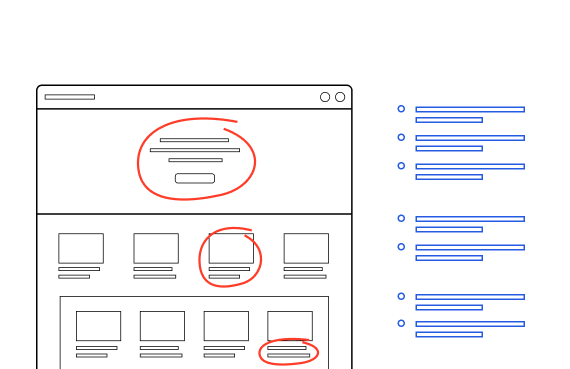
Having a basic understanding of the users is always important. Some of the work on the product required a quick turnaround in the early stages, so having something to quickly validate design decisions against would be critical. The archetypes provided a quick reference point for user empathy. Some examples below:

Correspondence User

Core needs
  • Set up shell of an exam record and hand over to the Exam Manager.
  • Input any correspondence that is received during the engagement phase of the exam lifecycle including opening and closing letter.
  • Close off the exam after and enter findings and create issues post closing letter, then hand over to Issue Management.
Behaviours
  • Expert users, spend the majority of their working week in the system.
  • Know the Standards incredibly well and the expectations on record creation.
  • Role only exists in North America, not Rest of World.
Pain points
  • Have to enter ‘dummy’ data in fields to be able to save a record.
  • Only need to enter 5 or so fields to create a record.
  • Need to create a batch of records simultaneously but no way to do that in the existing system.

Exam Manager

Core needs
  • Manage an Exam record during the engagement phase of the life cycle after hand off from the Correspondence Team.
  • Prepare materials and slides prior to an engagement with the regulators, including relevant historical data, open issues and any other relevant data.
  • Create records for meetings, record all meeting minutes and  upload any assets.
Behaviours
  • Mostly senior members of staff who are also Regulatory Engagement Leads in North America. Many different roles carry out duties for Rest of World.
  • A broad range of expertise levels as some are less hands on than others.
  • Rest of world users tend are less stringent about data entry and consistency.
Pain points
  • Find data entry cumbersome and slow. Feel they are re-entering a lot of data that is already in the system.
  • Struggle to know where to put info at times and have no confidence it’s entered correctly
  • Performance of the system greatly decreases when in EST working hours.

Competitive analysis of proposed CRM platform

Goals of Analysis

The team were considering outsourcing the project to a well known CRM platform that can be used for Regulatory Engagement as an alternative to working the existing system. I analysed it’s suitability as a replacement, any  to also take some lessons from what they are doing well that could feed into a in-house product.

SWOT Analysis

Strengths
  • A modern UI, with well organised hierarchy of information and clear visual distinctions between sections.
  • Ability to create action plans to supplement workflows and assign accountability for tasks.
  • Status and key information of a related record can be seen by hovering over a link to a related record.
  • Records have vertical timelines show all changes throughout the record lifecycle – ideal for governance users auditing.
  • Records are view only until users prompt to edit individual fields – simplifies the UI visually and guards against accident input.
Weaknesses
  • Terminology CRM-focused and not that fitting to regulatory language used by the company.
  • Regulator views focused on contact details instead of the associated records – the focus of a users work.
  • Assets associated with regulatory engagements require tagging and metadata, and are associated with specific records. They are just uploads in this product. A lot of associative information will be missing and require users to figure out the connections. 
Opportunities
  • There is a lack of coverage of different types of regulatory records within the CRM platform so it’s hard to see how it will be flexible enough to cover the basic requirements.
  • This product doesn’t provide enough detail around uploaded assets and with some work around these feature the in-house product can really stand above it.
  • The progressive disclosure of information is a massive improvement on the existing tool, but the CRM platform lacks the flexibility to move the focus to the right information.
Threats
  • The UI is modern, information is clear and concise and in fitting with what most application users would expect today. The current in-house product has had very little UX input to date, and doesn’t implement a design system. It’s hard to use, overly complicated so this would need to be addressed to catch up with the CRM product.
  • The CRM product has tight integration with Outlook in terms of calendar sync up and importing of records. Unless the in-house application can match this level of integration and ease it lags behind on a feature that is essential to automatically feeding information into the system.

Conclusion

There are some really nice features in the CRM tool, and the UI is a major improvement on the the existing tool, but it lacks the flexibility to focus on the right information. It also doesn’t fully cover the requirements and expectations of regulatory engagements the business demands, so the recommendation was to stick with an in-house solution.

Heuristic review of the existing tool

With this product never having UX input to date, this was an essential task as there would be plenty of room for improvement around usability. This task was completed by 2 designers, then collated into affinity boards and aligned with the themes discovered in user research: 

Data input and guidance

PROBLEM / RECOMMENDATION

  • Language used to describe fields can be unclear and lack differentiation between similar fields.
    
Provide more descriptive labels to make distinction between similar fields clearer.
  • Validation of input format and guidance is lacking in places.

    Provide examples of expected format to remove confusion.
  • Certain areas of the system need guardrails against invalid input. For example; users can be assigned roles when they don’t have permissions.

    Only allow data to be selected that is relevant for the current scenario to protect against invalid input.
  • Not easy to understand what needs to be entered in a highly complex record.
    Provide a clear understanding of what is required to complete a record, with a status of completion shown.
Ease of use / simplification

PROBLEM / RECOMMENDATION

  • Long scrolling record forms that are hard to navigate, collapsible areas don’t help reduce complexity.
    
Split the record smaller sub-sections to remove information overload, and focus on specific parts of the record in isolation.
  • A lack of consistency of presentation of similar records. Common information is not organised differently etc.

    Consistent display of common fields / child records to breed familiarity.
  • Too many actions displayed in a record overload the user with options.

    Primary actions shown only, secondary revealed as needed to reduce complexity.
  • Place within the system becomes unclear in child records – entire navigation changes.

    Consistent navigation throughout all levels of the system so current place / where you have come from is clear.
  • Child records aren’t linked to their parent record automatically which should be the case.

    Automatically link child records or prompt the user to assign link on creation.
Find my data easily

PROBLEM / RECOMMENDATION

  • Place within the system becomes unclear in child records – entire navigation changes.

    Consistent navigation throughout all levels of the system so current place / where you have come from is clear.
  • Search is limited to a section, not the whole system and limiting users view of the system.

    Modify the search to cover the full system to make discoverability more possible.
  • Navigation between child records requires jumping back to the parent record and is inefficient.

    Sideways navigation within child records will simplify reviewing child records.
Visibility of system status

PROBLEM / RECOMMENDATION

  • No way to understand status of records from list views.
    
Display a status column in the list view for quick visibility.
  • In record status is over-complicated, there is a workflow style view plus many other sub-statuses and hard to understand what is relevant.

    Reduce complexity of statuses, show only the relevant steps in view and progressively disclose others.
Help and documentation

PROBLEM / RECOMMENDATION

  • Lack of contextual help at the point of entering data.

    Provide help that is contextual and indicates standard requirements at the point of entry for clearer guidance.
  • It’s not that clear what help resources are available. located resources are in separate systems.

    Make a central place for help with links to external resources and tighter integration in system.

Conclusion

There are some really nice features in the CRM tool, and the UI is a major improvement on the the existing tool, but it lacks the flexibility to focus on the right information. It also doesn’t fully cover the requirements and expectations of regulatory engagements the business demands, so the recommendation was to stick with an in-house solution.

UX priorities based on research outcomes

Based on outcomes of the research a number of key UX initiatives were identified and proposed.

Better guidance on data input with stronger guide rails

Based on research feedback it has become clear that a lot of users struggle to populate records correctly. Governance users feedback has indicated they spend a lot of their time fixing incorrectly inputted record information. The guardrails and guidance for input need to improve so users can confidently enter data.

Simplification of record views with progressive disclosure of editing controls

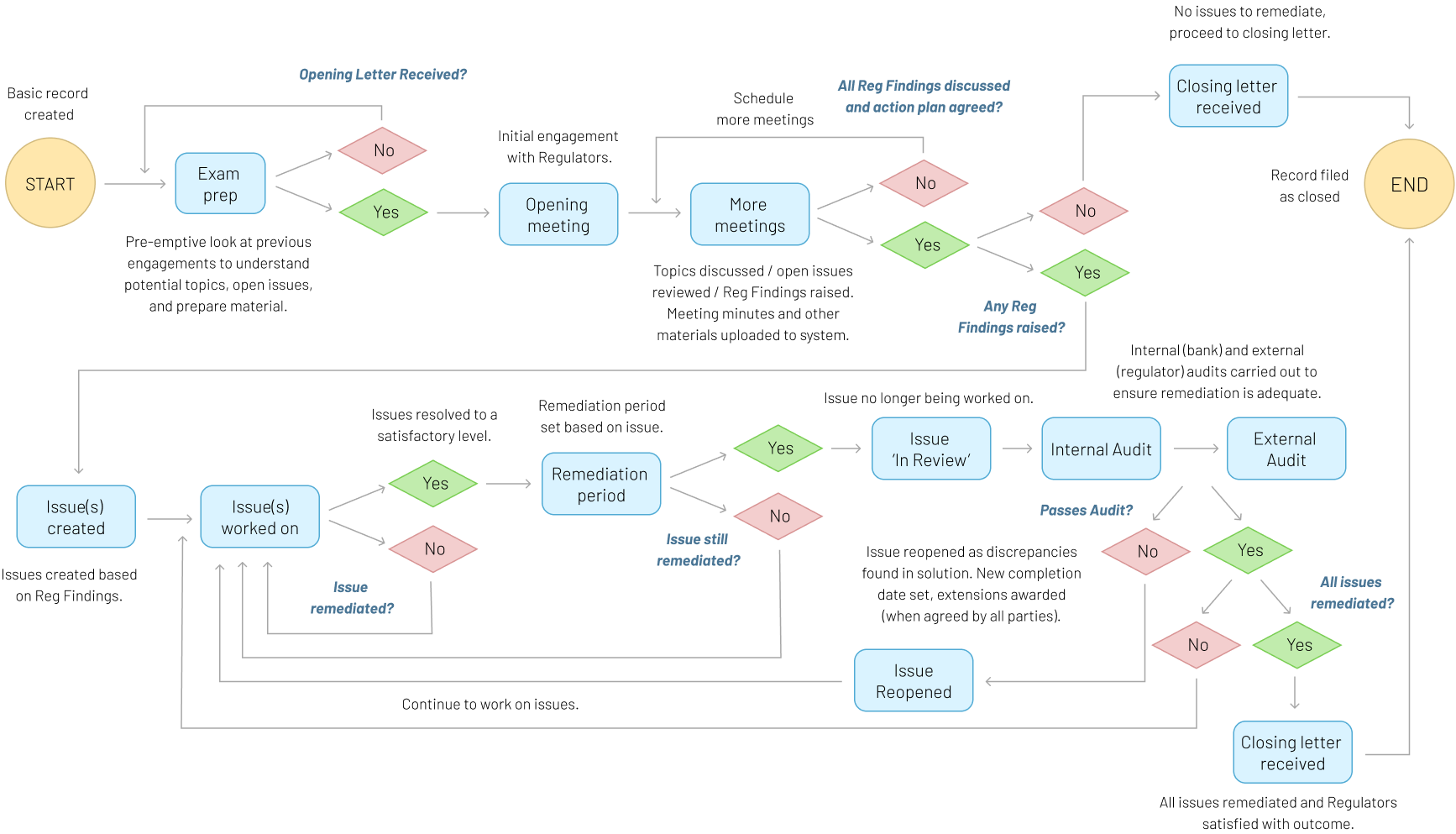
Speaking to the different user groups revealed some patterns of use of records in the system. Multiple user roles want to review a record and won’t make changes, though the default view of a  record is to show the extensive list of editable form fields. This complicates the display of records and opens up the possibility of accidental input.

Better visibility of record status

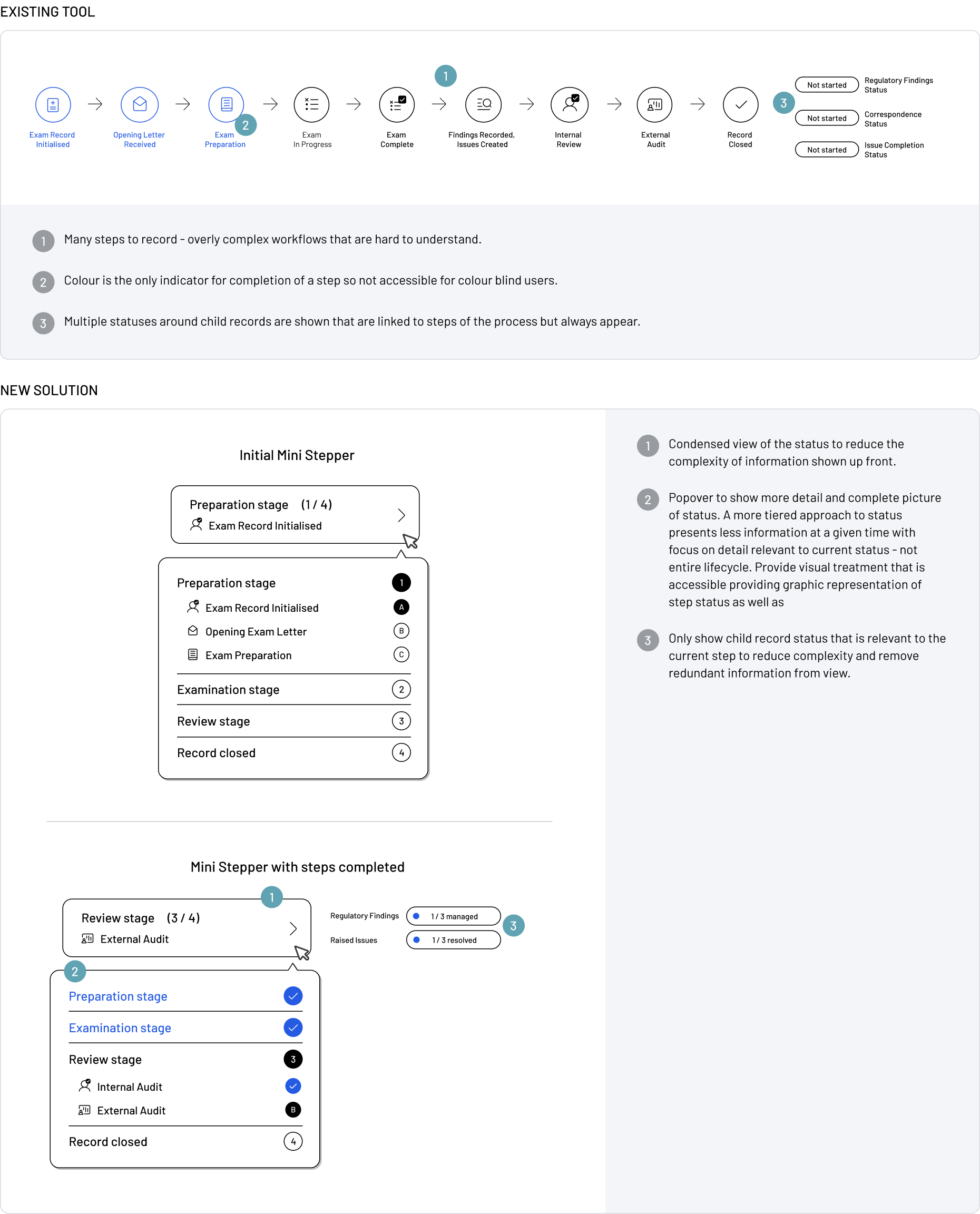
Users have indicated that record status can be so complex that is very difficult to understand the current state. A new approach is required to allow users to fully understand the records progression and all statuses of underlying child records.